professional portfolio
Graphic Designer | Multimedia Design, Presentation Specialist, Brand Identity & Creative Technologies
ABOUT ME
I am a masters-educated Graphic Designer, specialising in brand design and governance of content libraries, presentation and pitch deck development, digital and printed editorial publications, illustration, information graphics, motion graphics, and interactive learning design, using innovative new technologies to sustain high levels of focus and interest.
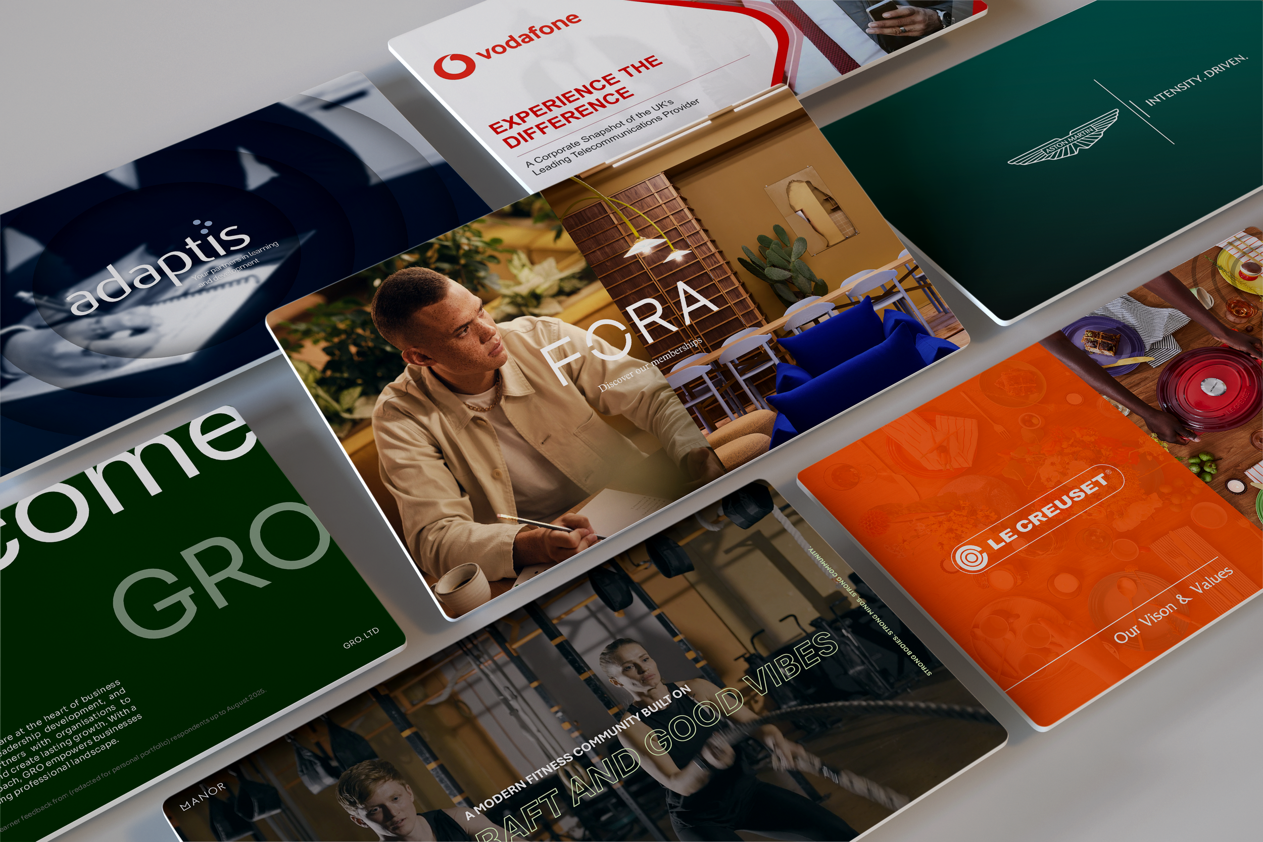
My presentation and pitch deck work has reached boardroom level at Aston Martin, Le Creuset, and Vodafone, with designs recognised at senior leadership level for their precision and impact. The quality of this work has drawn attention beyond the business itself, with Mehmet Yocom, Aston Martin's Head of Design, Leadership and Culture, noting that the attention to detail across both the visuals and messaging took the work to another level.
Alongside this, I create motion graphics, illustration, and interactive digital learning experiences that sustain engagement and bring complex ideas to life, from self-guided programme tours and onboarding videos through to full-scale branching scenarios and conversational experiences.
At Adaptis, I lead the design team, drawing on technical skills across Adobe Creative Cloud, including Photoshop, Illustrator, InDesign, and After Effects, Microsoft 365 to create eye-catching PowerPoint presentations and documentation, Articulate Rise and Storyline, Synthesia, and Vyond to develop interactive and engaging learning design, activities, and video content, and Figma to design and develop websites, including adaptis.co.uk.
I bring a commercially aware, innovation-led approach to everything I produce. My work spans brand identity, editorial, infographics, and storyboarding, underpinned by an iterative design thinking methodology developed through masters-level study and refined across years of client-facing practice. I take great pride in the craft behind every piece, and the meaningful impact good design can make.
presentation & pitch decks
Project:
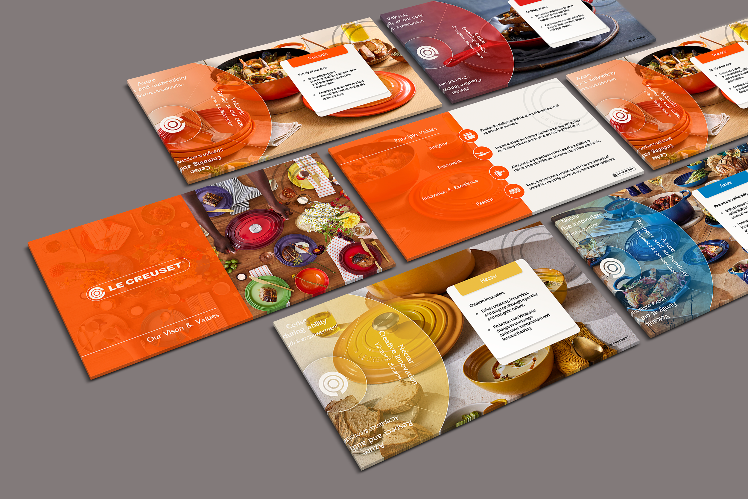
Le Creuset | Vision: Luxury Kitchenware
Year:
2026
Year:
2026
Project:
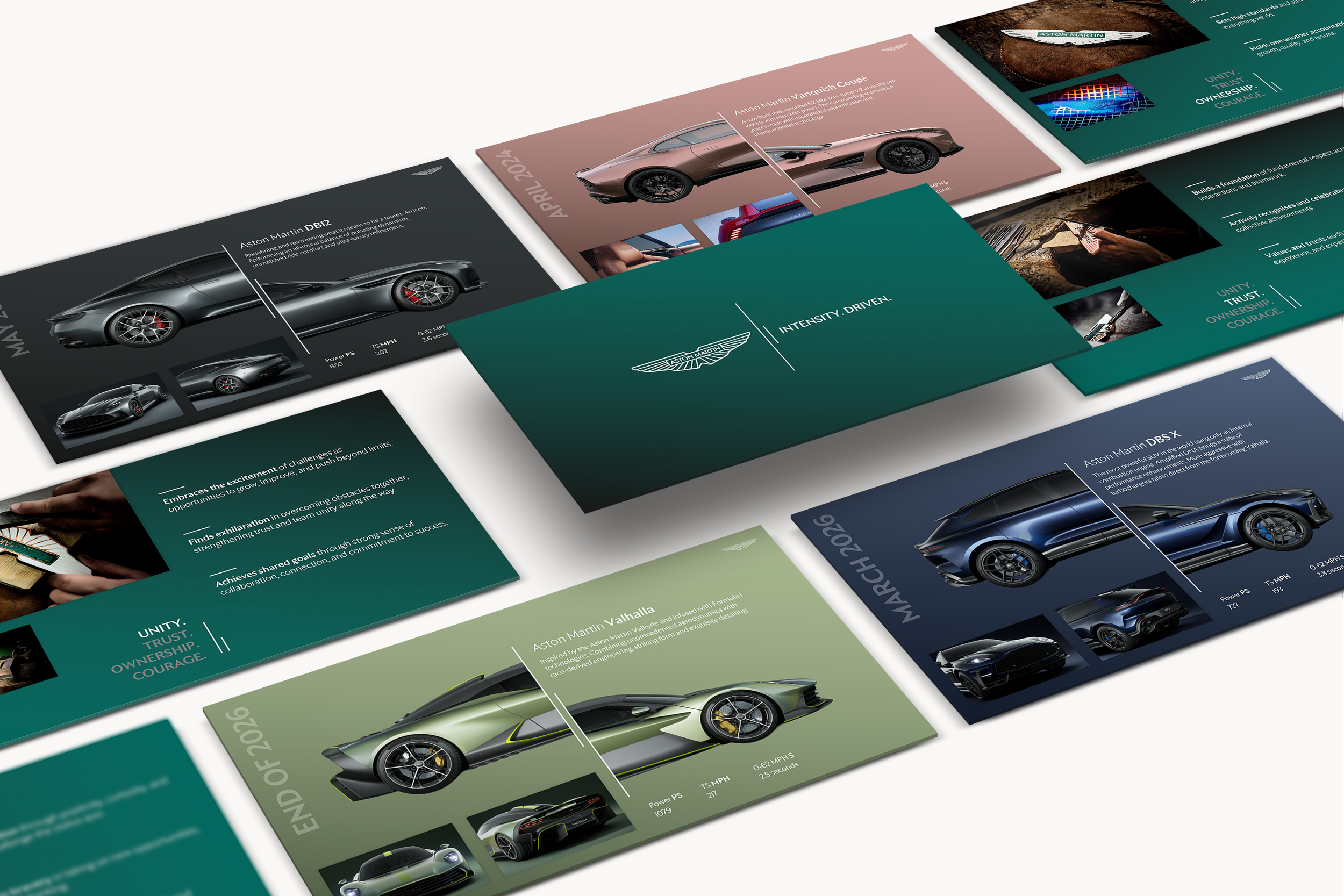
Aston Martin | Luxury Car Maker & Manufacturer
Year:
2025
ProProject:
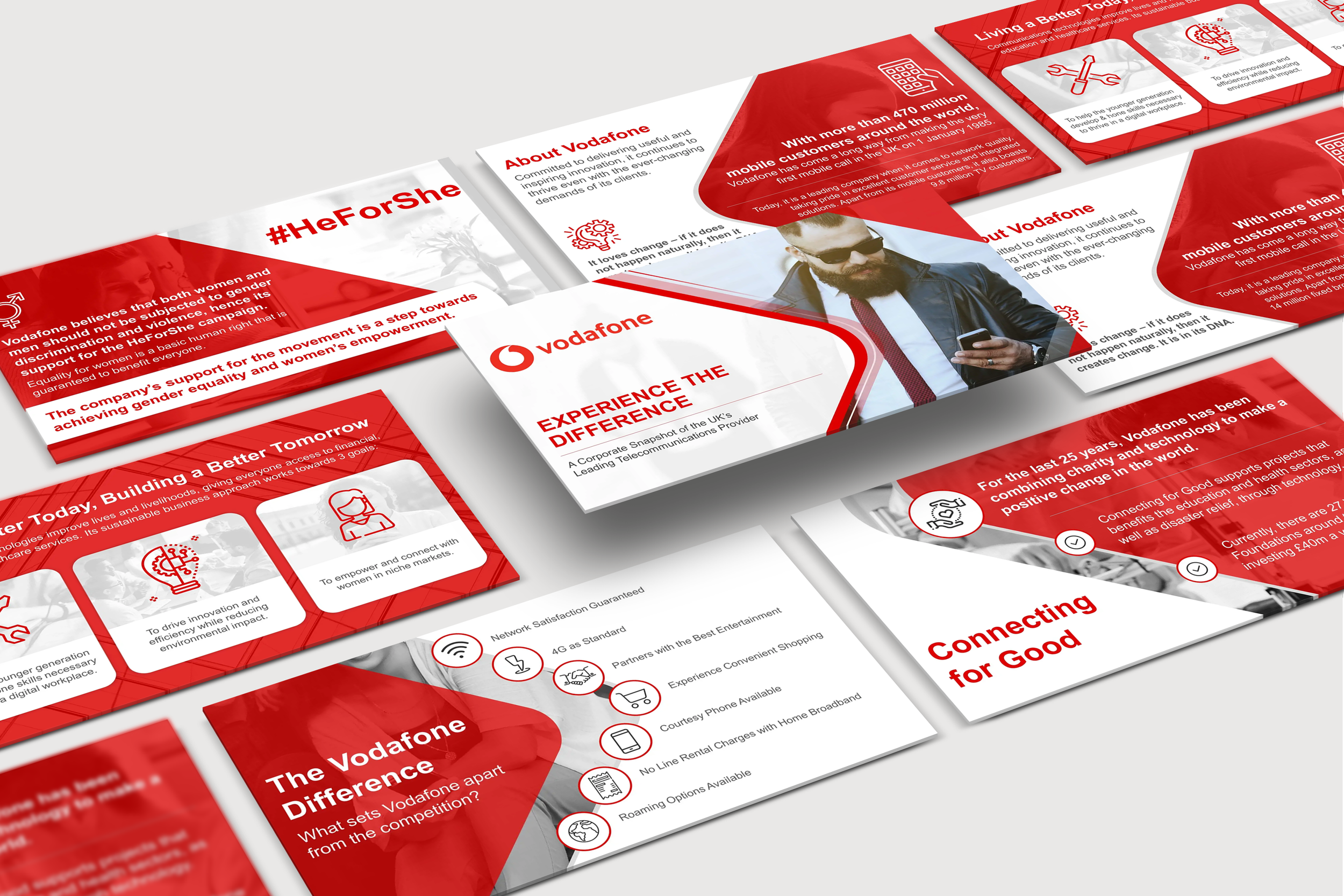
Vodafone | International Telecommunications Network
Year:
2025
Project:
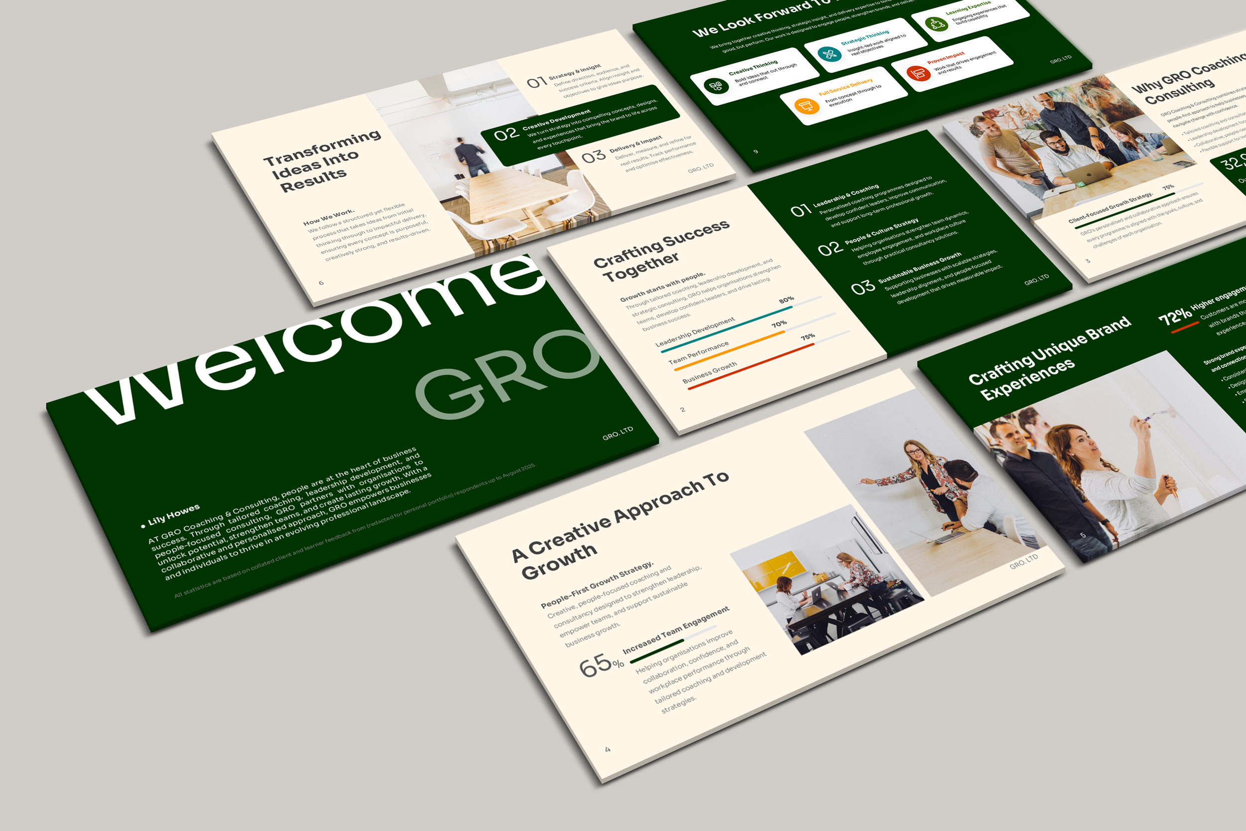
GRO Coaching & Consulting | Leadership & Coaching
explore some my deck design, animations & transitions
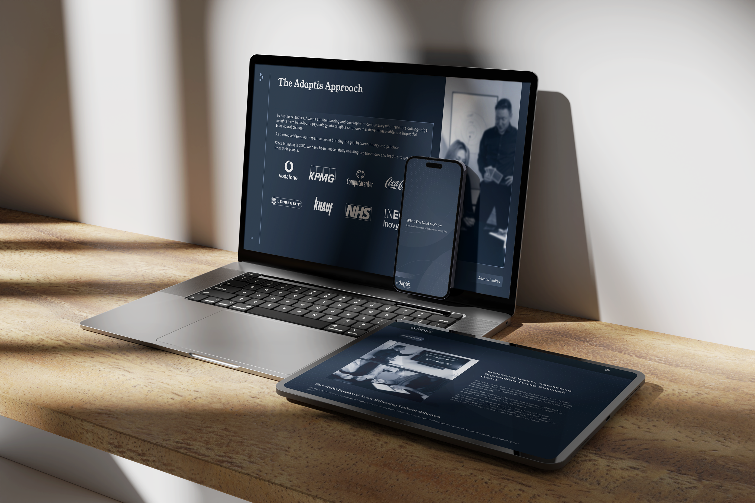
Presentation and pitch deck design sits at the heart of what I do. From internal leadership decks to high-stakes client-facing keynotes, I design presentations that communicate with clarity, confidence, and visual impact, ensuring every slide serves the narrative and reflects the brand it represents.
My work in this space has reached boardroom level at some of the UK's most recognisable names, including Aston Martin, Le Creuset, and Vodafone. Each project demanded a deep understanding of the brand's visual language, values, and audience, translating that into slide-by-slide design that feels considered and intentional, from typography and colour treatment through to layout hierarchy, data visualisation, and iconography. The result is always a deck that does not just look the part, but actively supports the person presenting it.
This work has been recognised at senior leadership level for its precision and impact. Mehmet Yocom, Aston Martin's Head of Design, Leadership and Culture, noted that the attention to detail across both the visuals and messaging took the work to another level — feedback that speaks to the standard I hold myself to on every project, regardless of the client or brief.
Across Microsoft PowerPoint, Keynote, and Google Slides, I build presentations that are as functional as they are beautiful, structured for ease of use so that non-designers can work within them confidently, without compromising the integrity of the design.
systems & software
Adobe creative cloud
14 Years Experience
microsoft 365 suite
20 Years Experience
Articulate storyline & rise
7 Years Experience
Synthesia, vyond
4 Years Experience
figma & figjam
3 Years Experience
AI TOOLS & CREATIVE WORKFLOWS
4 Years Experience
BRAND IDENTITY & style guides
Branding is where design thinking meets long-term impact. Getting it right means building a visual identity that works across every touchpoint, from a logo on a tote bag to a slide deck in a boardroom, consistently, and without needing a designer in the room every time someone opens a file.
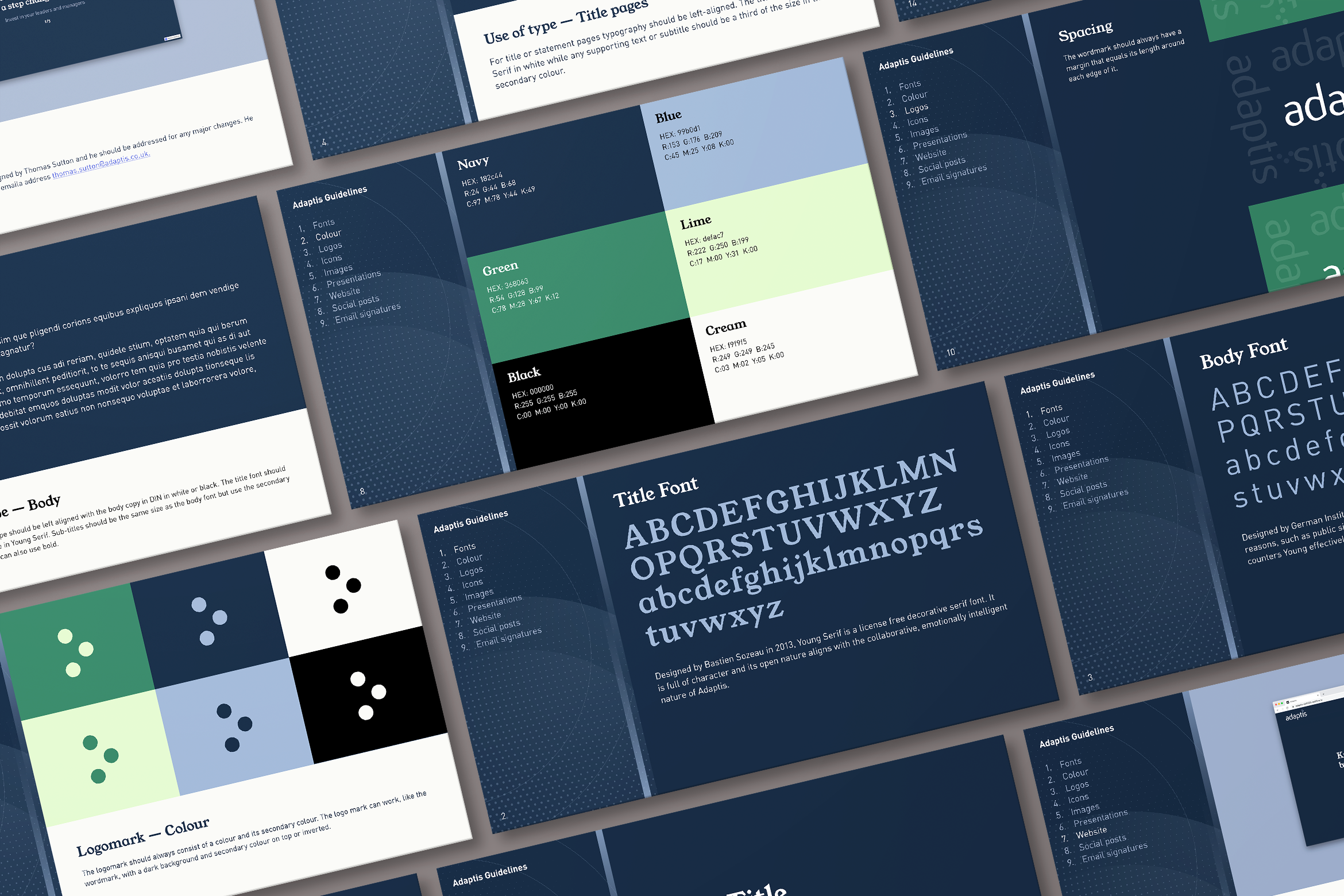
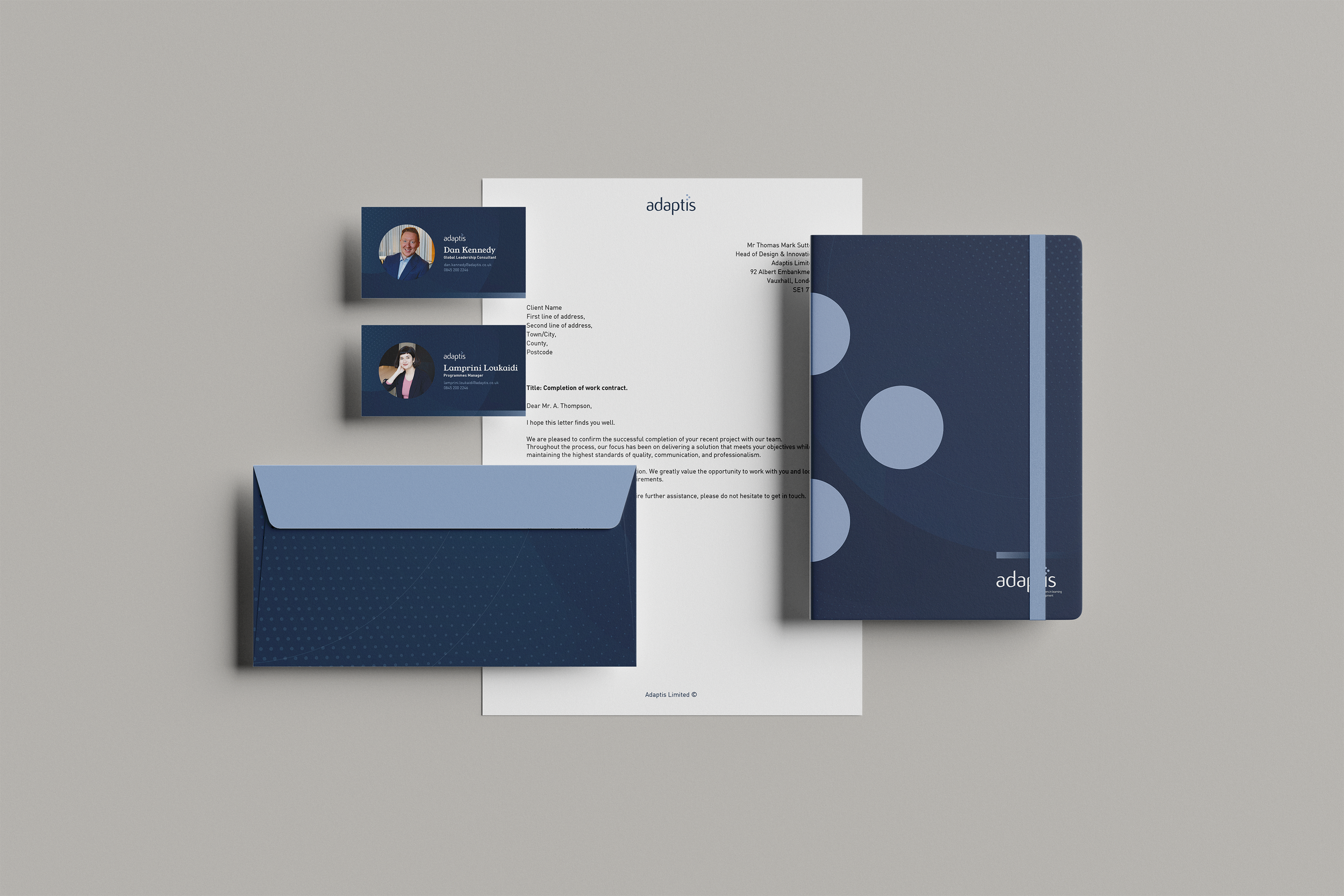
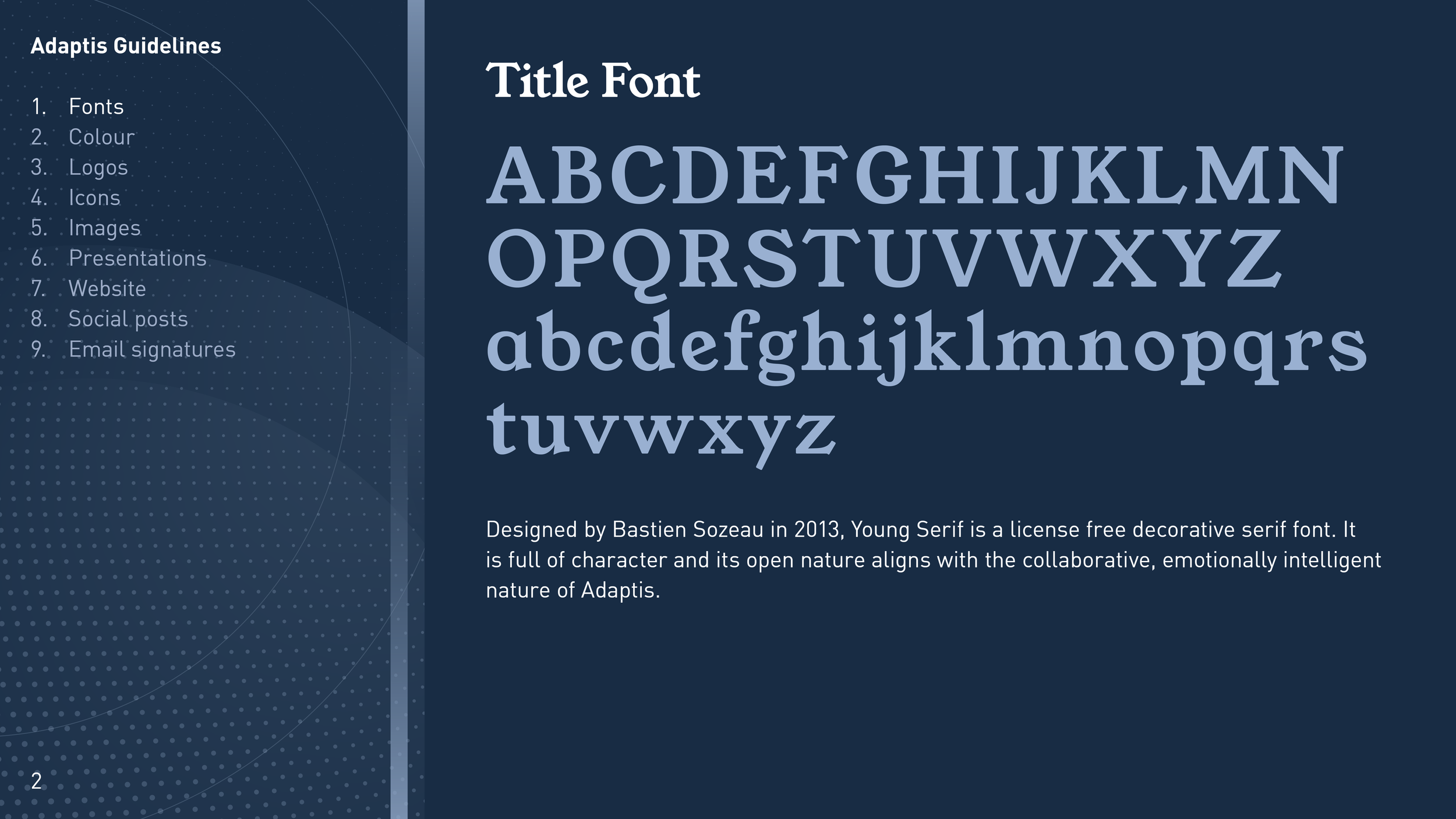
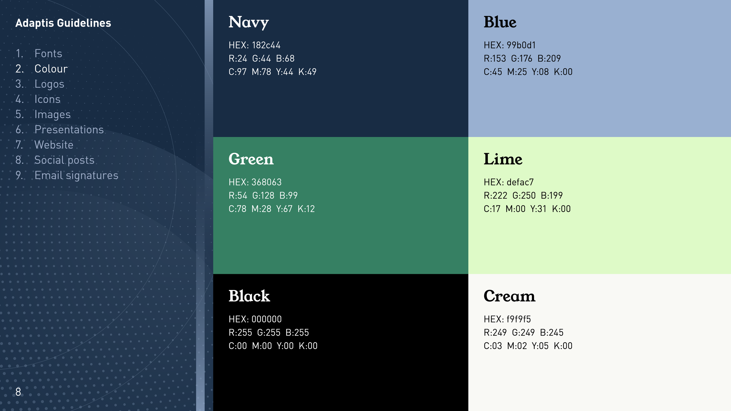
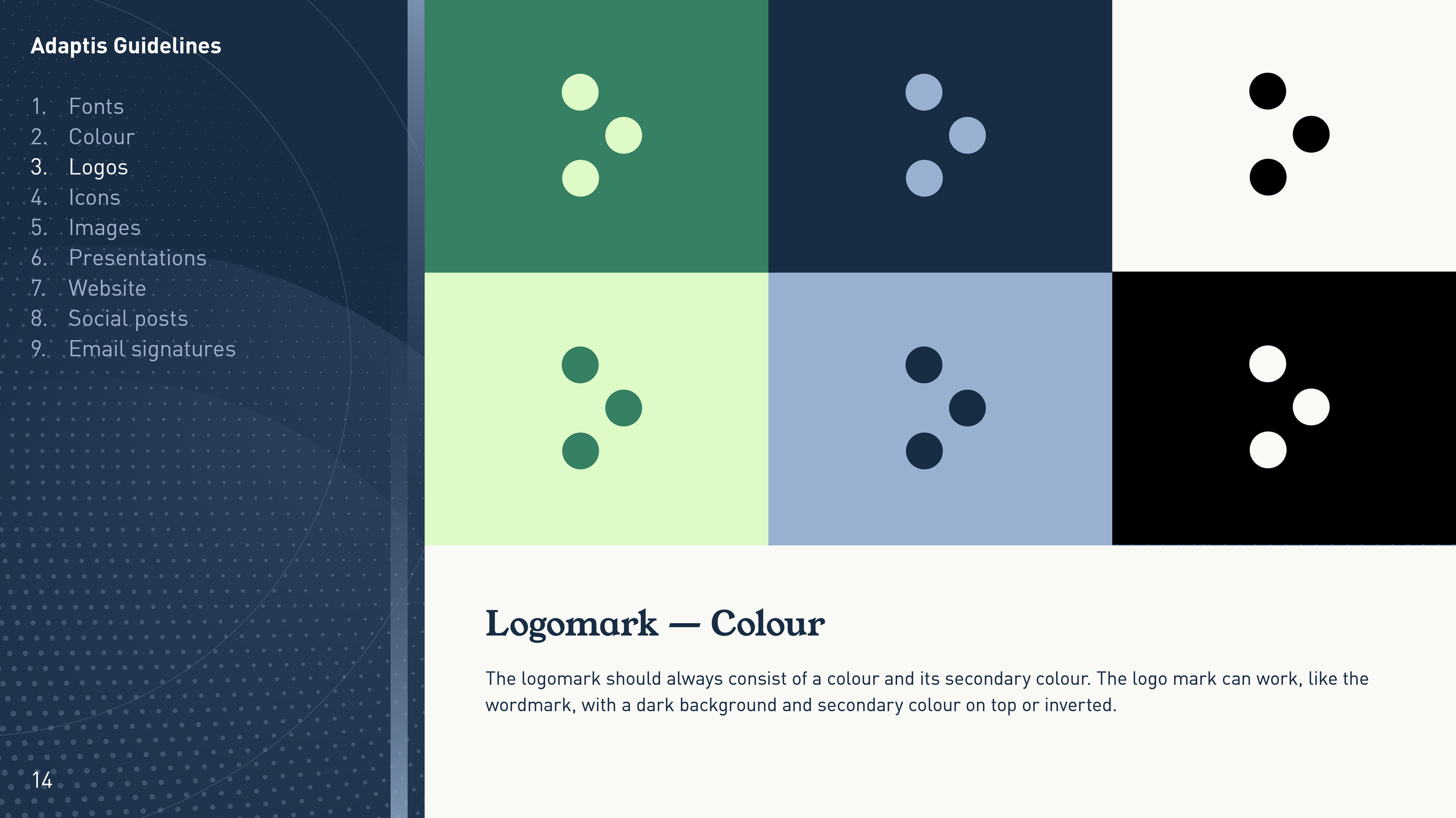
At Adaptis Limited, where I have led the design team for over five years, I developed the companies full visual identity from the ground up. This included the logotype and its distinctive three-dot accent device, a complete colour system specified across HEX, RGB, CMYK, and HSL for consistency across digital and print, a dual typeface system pairing YoungSerif for display and DIN for body copy, presentation deck templates, workbook and publication layouts, LinkedIn assets, and a photography treatment using a deep navy duotone overlay to unify varied source imagery into a consistent brand tone. The result is a design system built to be used by a large team of designers and non-designers alike, without ever compromising the standard of the output.
More recently, I took on freelance brand work with Computacenter, and largely with Knauf, one of the world's leading manufacturers of building materials and interior systems, operating across more than 90 countries. The scope covered logo refinement and application guidelines, typeface selection and typographic hierarchy, a cohesive colour system, PowerPoint presentation deck templates built for use across regional and international teams, and a full suite of event and promotional assets including tote bags, mugs, roller banners, and exhibition materials, all designed to hold together whether on screen in a conference room or printed and handed out at an industry event.
What ties all of this work together is a belief that a brand is only as strong as its system. A logo without guidelines is just a mark, and a colour palette without structure creates inconsistency. This work is about building something that lasts, scales, and gives an organisation the tools to communicate with confidence across every context it operates in.
Project:
Adaptis Limited | Company Rebranding
Year:
2023 - 2026

explore some of my template design systems


TESTIMONIALS
— Sara Burks| Founder & Managing Director “Thomas has had a genuinely transformative impact at Adaptis Limited, reshaping not only our brand image but also the way we think about delivering value to our clients. His ability to blend creativity with strategic insight has elevated our presence, making our messaging clearer, more compelling, and far more aligned with the needs of the organisations we support. His work has set a new benchmark for quality and originality within the company, and the difference is visible in both client feedback and the confidence with which we now present ourselves. Aside from that he is a lovely colleague and team mate.”
— Charlotte Burton-Barker | Global Consultant
“Thomas is someone who brings a really positive energy to the team and is great to work with day to day. His personable and supportive approach, along with his willingness to help, means he brings so much to the team dynamic. He’s always willing to turn his hand to different roles to support the success of the team. At Adaptis, he has gone beyond his design role to support our IT systems, client management and the smooth running of the office experience.
In his design work at Adaptis, he consistently produces high-quality work both internally and for our clients. He brings a thoughtful and creative approach to every project and always takes the time to fully understand and respond to client needs. He’s quick to adapt to new technology and ideas, helping keep us fresh and forward-thinking in the Learning and Development space.”
— Dan Kennedy | Client Negotiations
“I’ve had the pleasure of working alongside Thomas at Adaptis for the past five years, and throughout that time he has consistently demonstrated exceptional innovation, enthusiasm, and professionalism.
Thomas brings outstanding value to the business in everything he does. He is highly knowledgeable in his field and has played a pivotal role in building and strengthening key areas of our organisation, from IT support processes and CRM development to branding, marketing, and the successful delivery of numerous client LMS platforms. His ability to combine technical expertise with strategic thinking has made a real and lasting impact.
Beyond his professional capability, Thomas is a genuine pleasure to work with. He is collaborative, dependable, and always approaches challenges with a positive, solutions-focused mindset. He is very much a team player, generous with his knowledge, and consistently willing to go the extra mile to support colleagues and clients alike.
— Dave Twiss | Senior Project Manager
“I have been working with Thomas for the past 2 years at Babcock International as part of The Media Team.
Thomas is an extremely talented Graphic Designer/ Media Developer and has blown me away with his graphic designs and animations. He works very well under pressure and can easily manage his work tasks ensuring they are delivered on time, accurate and to the highest quality.
Thomas is always being proactive and goes above and beyond his requirements. He can quickly visualise and sketch out concepts and is always willing to help others, a real team player and a pleasure to work with and highly recommend him.
EDITORIAL & PUBLICATIONS
Project:
Adaptis Limited | Company Brochure
Year:
2025 - 2026
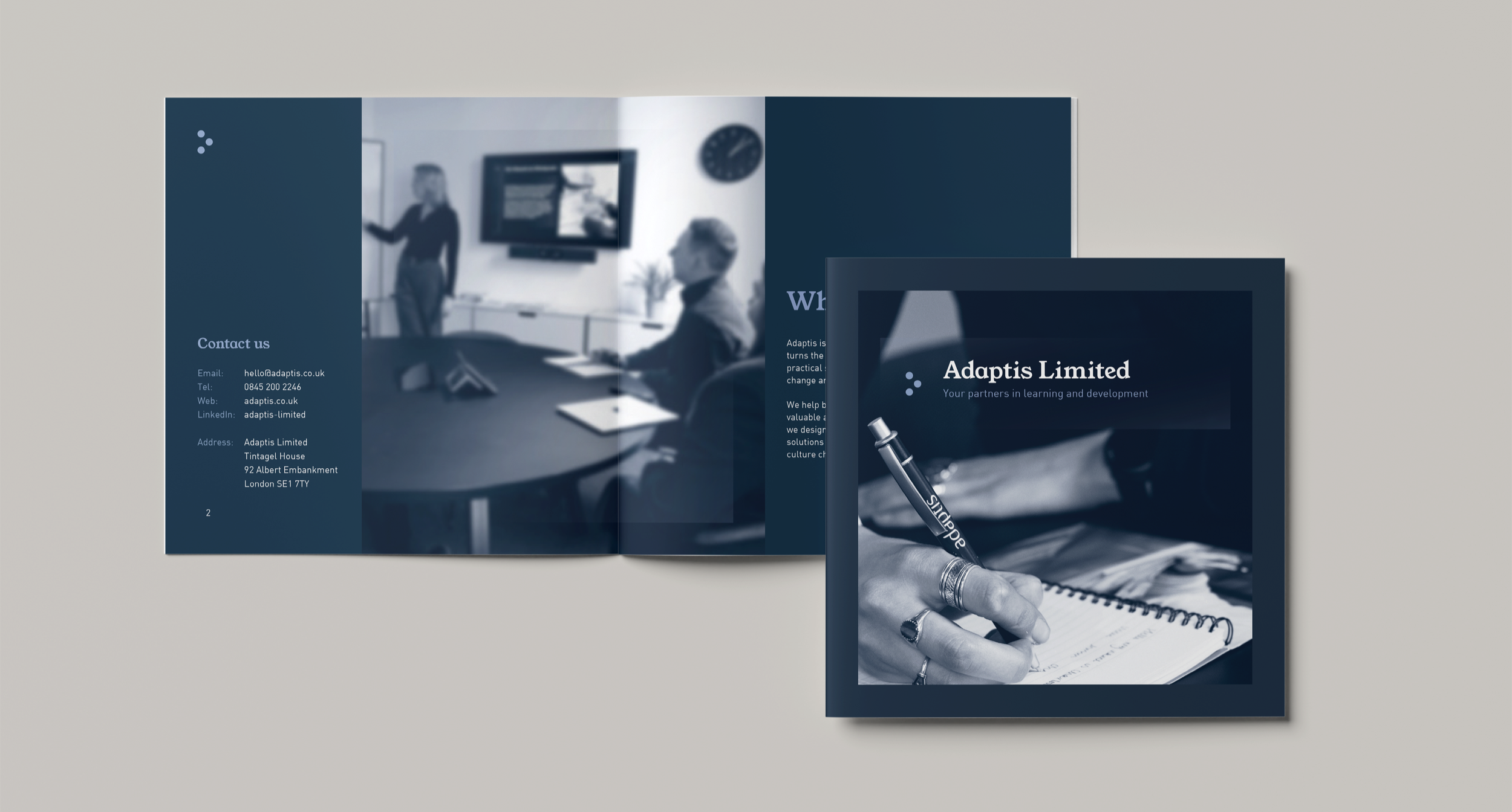
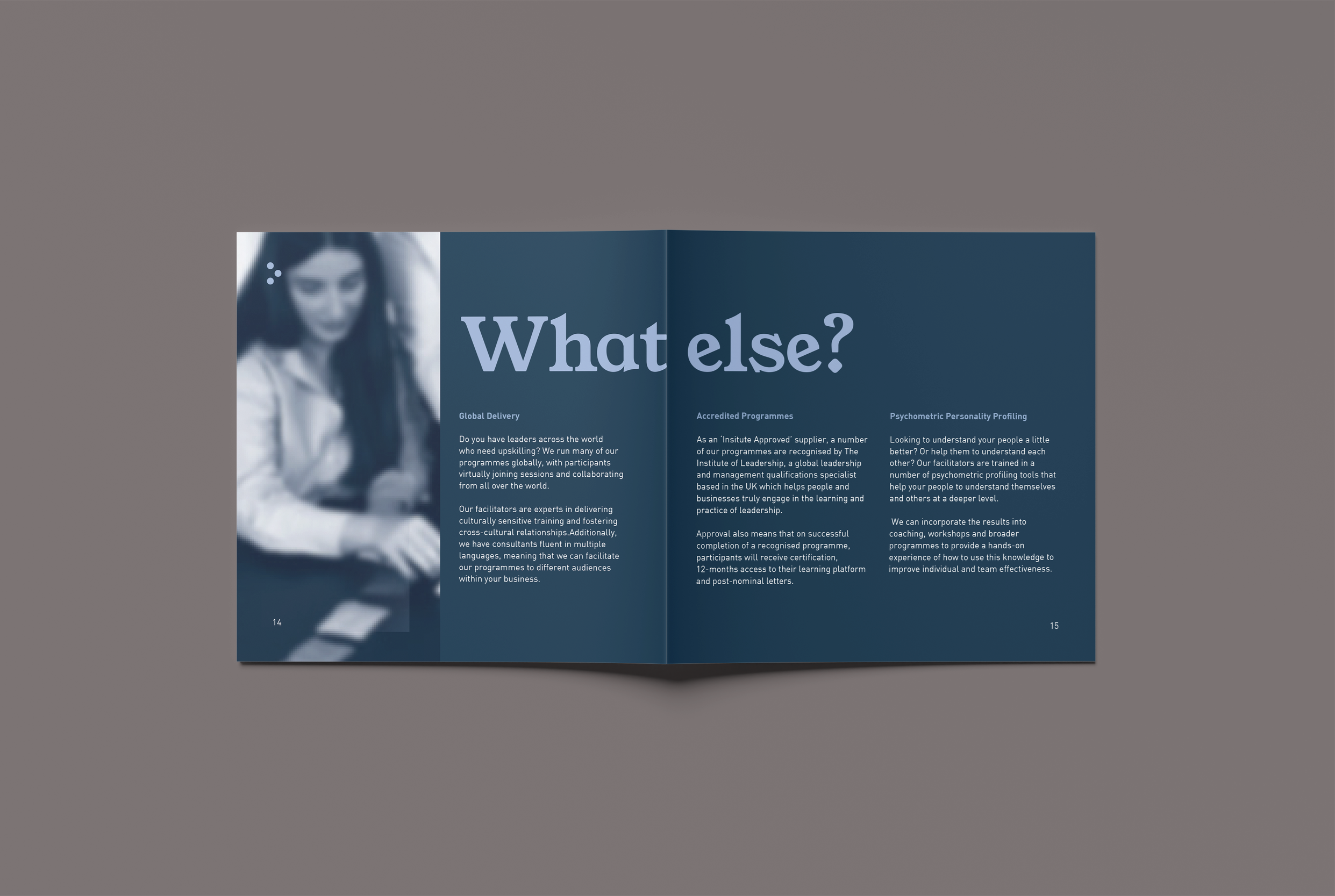
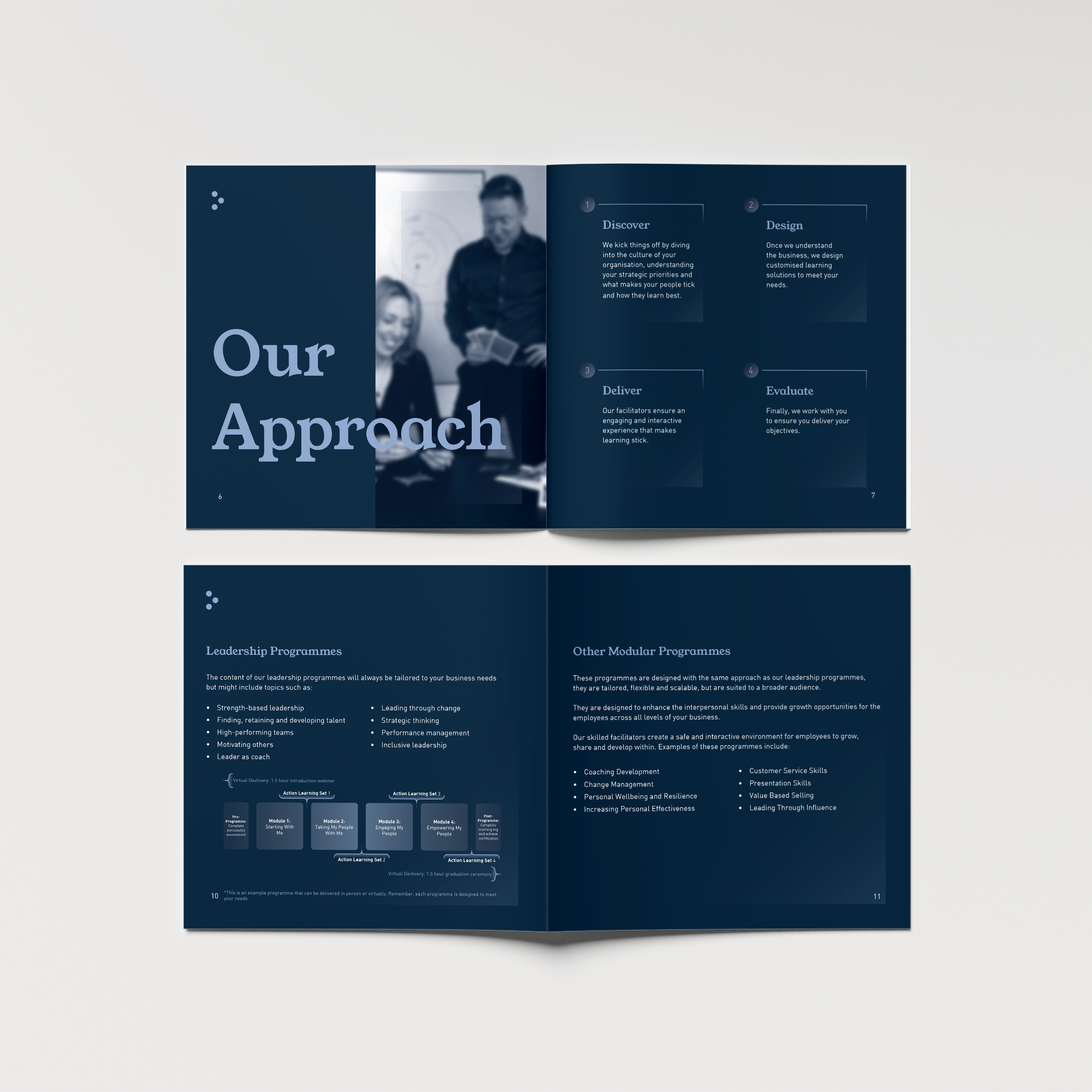
This company brochure was designed to serve as Adaptis Limited's primary client-facing document, introducing the business, its approach, and its full suite of learning and development services to prospective clients at organisational and FTSE level. The design needed to feel premium and authoritative while retaining the warmth and people-first quality that sits at the heart of the Adaptis brand.
The layout uses a structured landscape grid throughout, balancing generous white space with full-bleed photography treated in a deep navy duotone to unify varied source imagery into a consistent, considered tone. YoungSerif handles all display and heading work, its editorial gravitas giving each section opener a confident, distinctive presence, while DIN carries body copy cleanly at smaller sizes across multi-column layouts. Typography, spacing, and hierarchy were carefully considered at every spread to ensure content could be absorbed quickly without ever feeling dense or cluttered.
Produced to full print-ready specifications, including correctly set bleed, safe zones, CMYK colour profiles, and high-resolution image placement, the brochure was prepared for commercial print while remaining equally strong as a digital PDF for email distribution and client presentations.
Project:
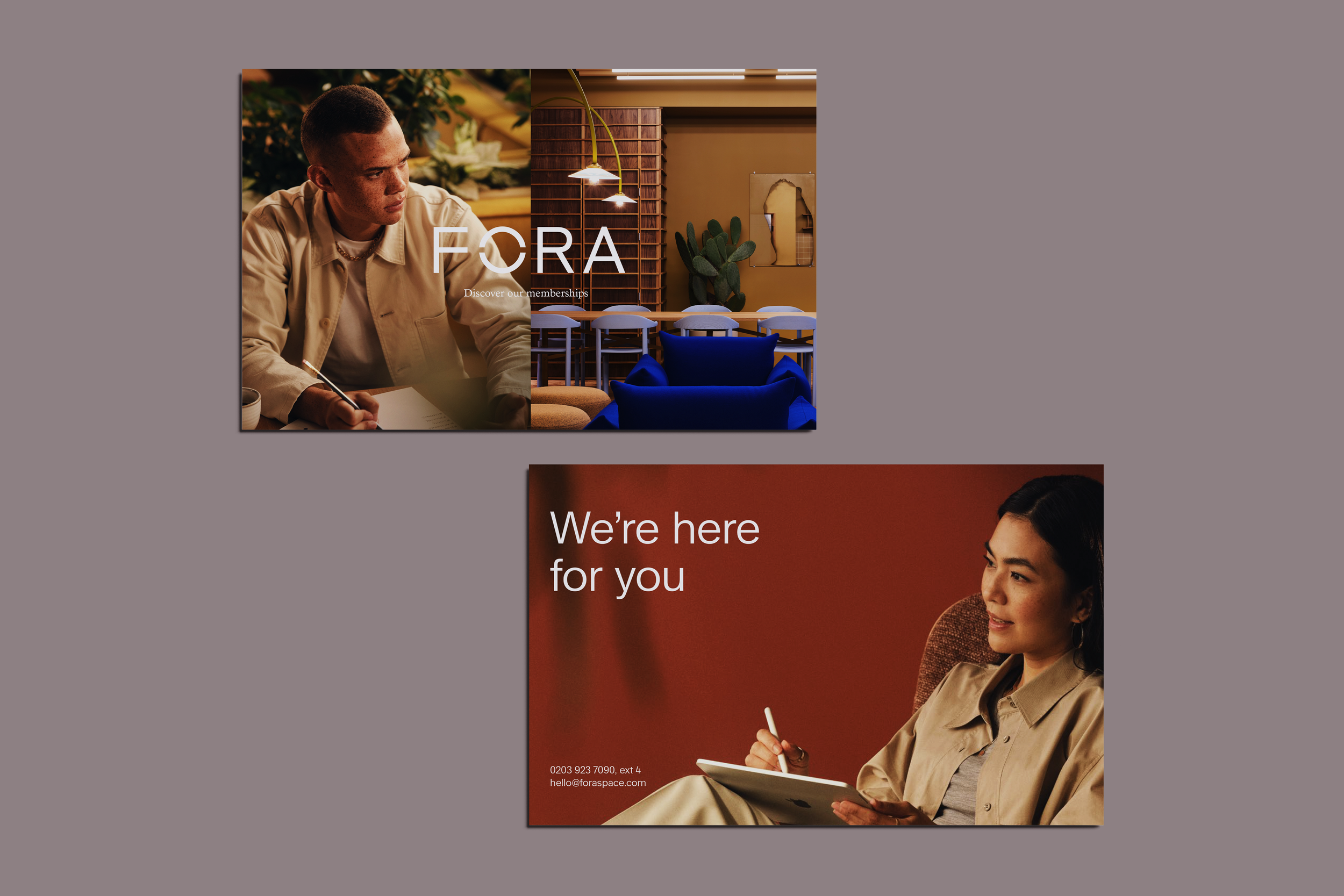
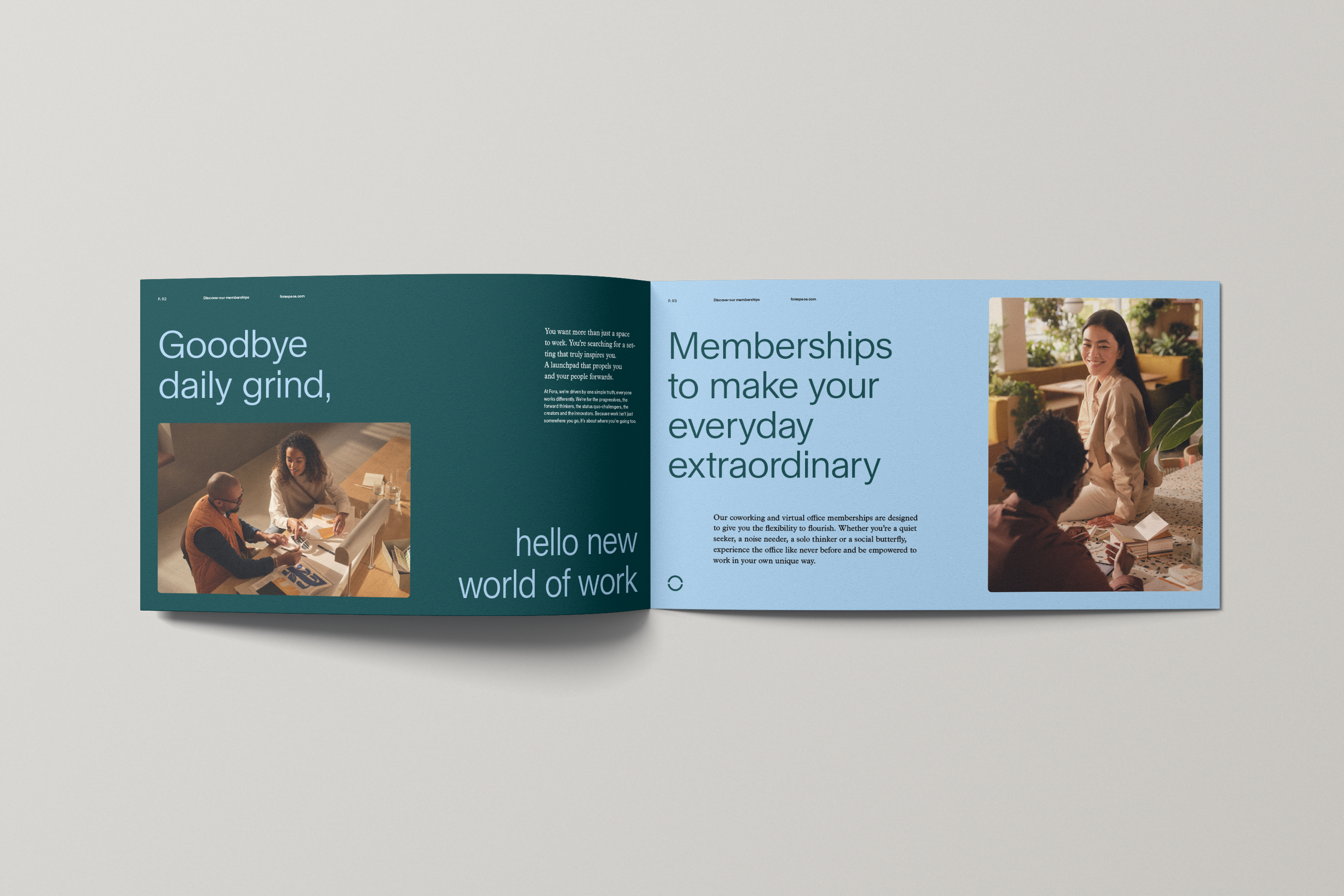
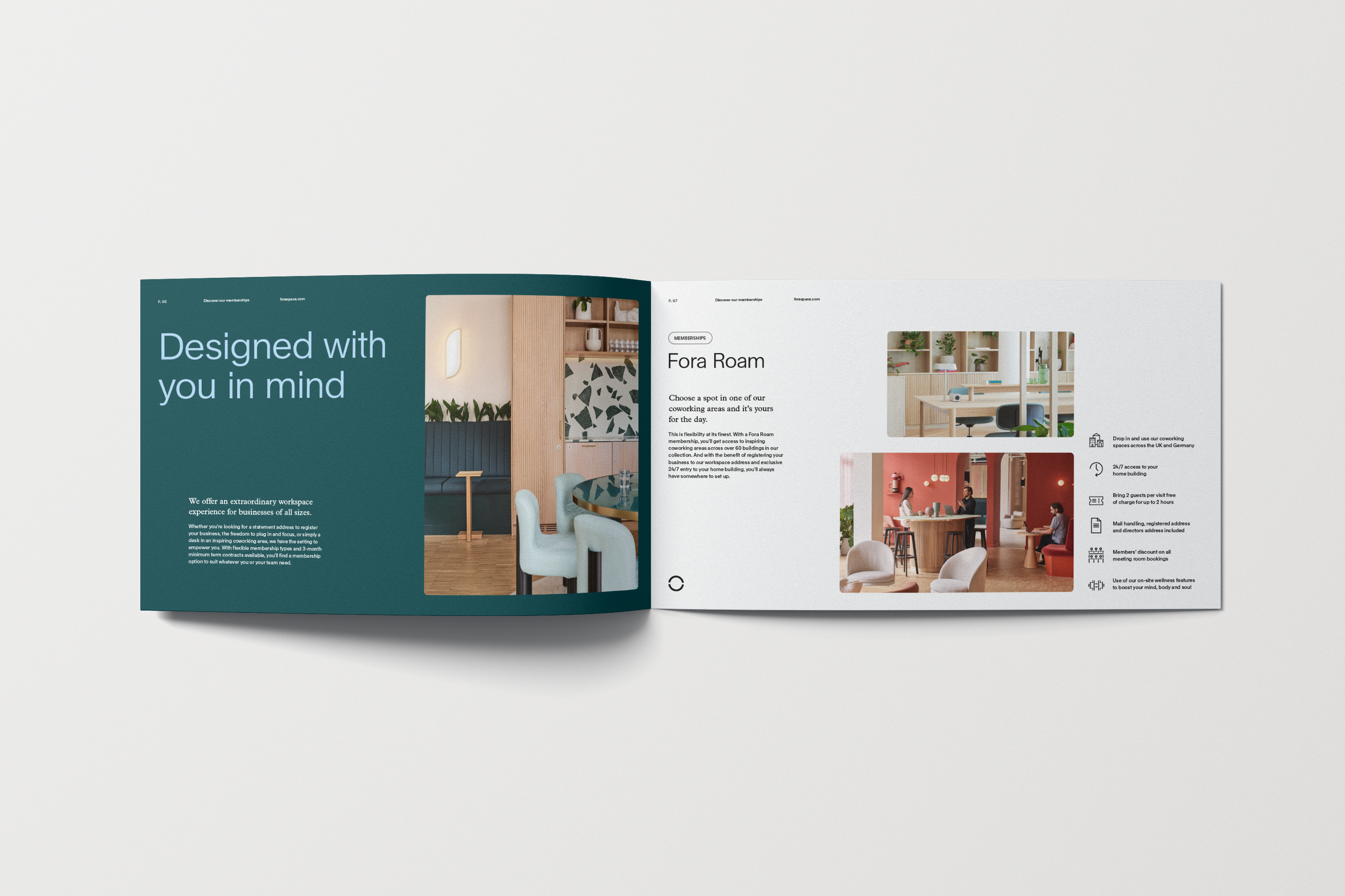
Fora Space | Company Brochure
Year:
2025 - 2026
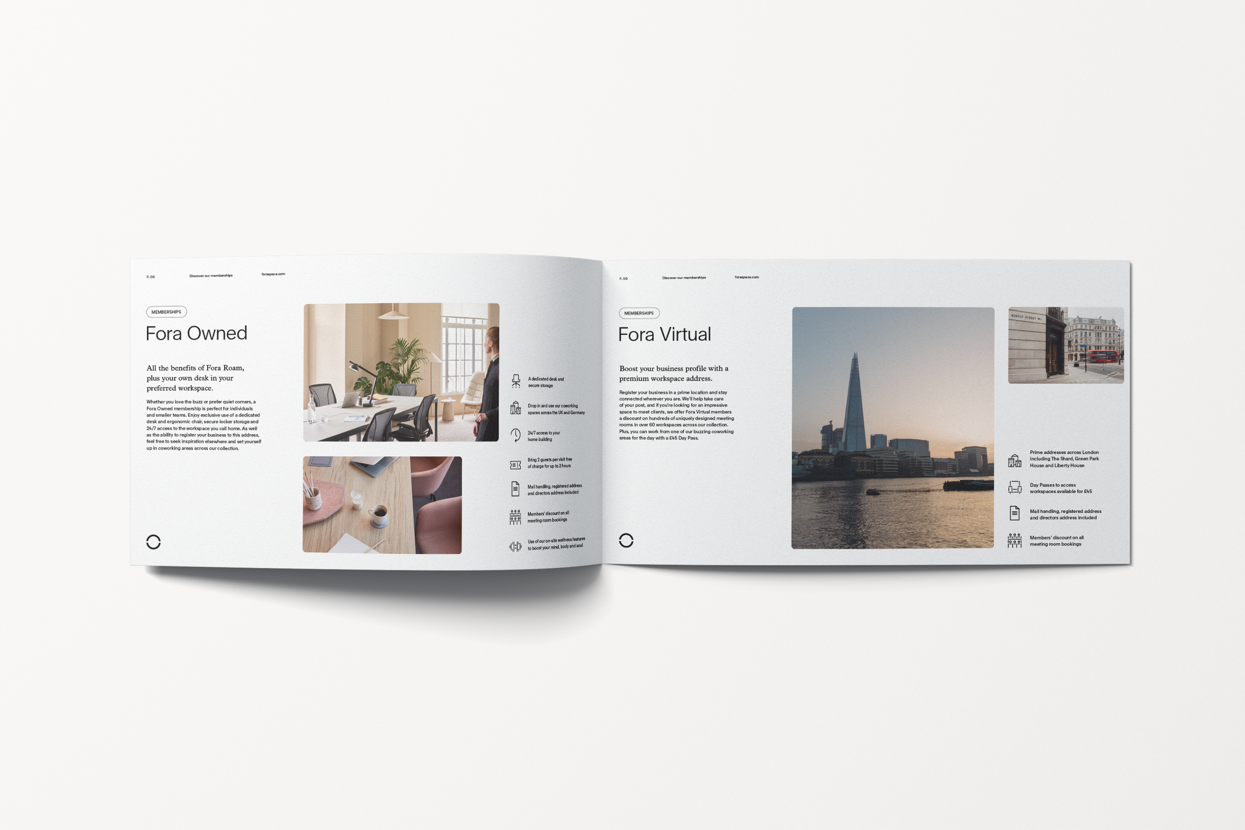
This membership brochure was produced for Fora, a premium flexible workspace provider operating across more than 60 locations in the UK and Germany. The brief required a document that could communicate a diverse range of membership options clearly and compellingly, while reflecting the premium, forward-thinking identity of the Fora brand.
The layout uses a bold editorial approach throughout, with large-scale display typography anchoring each section and creating confident, scannable spreads that guide the reader naturally from one membership tier to the next. A considered three-palette structure moves the document through deep teal, powder blue, and warm terracotta sections, giving each chapter a distinct visual identity while maintaining overall coherence. Photography is integrated at scale, balancing aspirational lifestyle imagery with interior shots of the workspaces themselves, grounding the brand promise in the physical reality of the spaces.
My editorial and publication work spans both print and digital, covering branded brochures, marketing collateral, magazine features, workbooks, and supporting print assets. Each piece is developed with a strong emphasis on visual hierarchy, using scale, spacing, typography, and composition to guide the reader naturally through the content while maintaining clarity and a polished, contemporary finish. A strong understanding of grid systems, white space, and typographic structure underpins everything I produce, ensuring layouts feel considered rather than constructed.
Alongside the design itself, I bring a thorough understanding of print production, including setting up files to the correct specifications for commercial print, managing bleed, safe zones, colour profiles, and resolution, and preparing export-ready artwork across CMYK and RGB environments. Whether a piece is destined for a digital screen or a print run, the technical groundwork is built in from the start, so the final output looks exactly as intended.
INTERACTIVE LEARNING CONTENT
Click the images to preview.

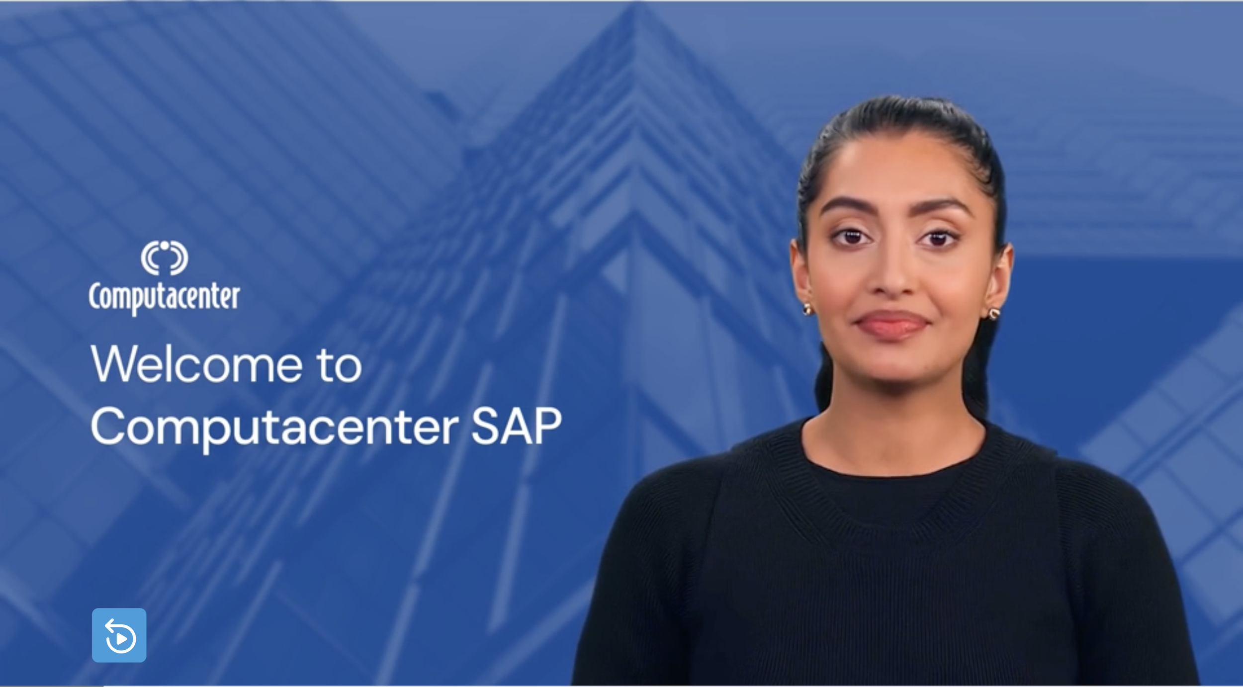
My interactive design approach combines the conversational delivery strengths of Synthesia with the structured learning capabilities of Articulate Storyline to create engaging, accessible, and scalable digital learning experiences.
Using AI-generated presenters and voiceover through Synthesia, I can produce polished, professional video content at pace, without the cost or logistical complexity of traditional video production, making it possible to personalise content for different audiences and update it quickly as needs evolve. This is layered with the interactivity and branching capability of Articulate Storyline, where learners can navigate scenarios, make decisions, and receive tailored feedback in real time.

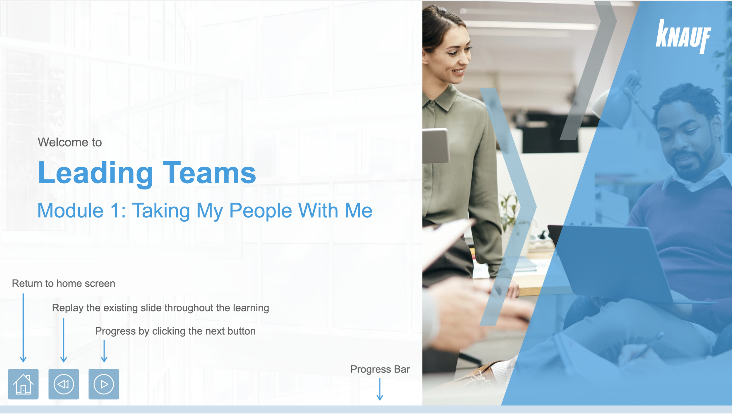
I focus on balancing clarity, interaction, and pacing, using scenario-based learning, motion, and visual hierarchy to guide attention without overwhelming the learner. The approach prioritises intuitive user journeys, modular content structures, and strong narrative flow, ensuring complex information remains engaging, human-centred, and easy to retain.
Every piece is designed with the end user firmly in mind, stripping back anything that adds friction and amplifying anything that builds understanding, confidence, or connection with the material.

Project:
Adaptis Limited | HBDI Interactive Activity
Year:
2025
Year:
2026
Project:
Adaptis Limited | Bitesize Learning Video
Year:
2026
Project:
Knauf | LMS Global Programmes Walkthrough

Project:
Computacenter | SAP Onboarding
Year:
2024
Project:
Knauf | Leading Teams Post-Work
Year:
2024
Project:
Adaptis | Security Compliance Lesson
Year:
2026
ILLUSTRATIONS
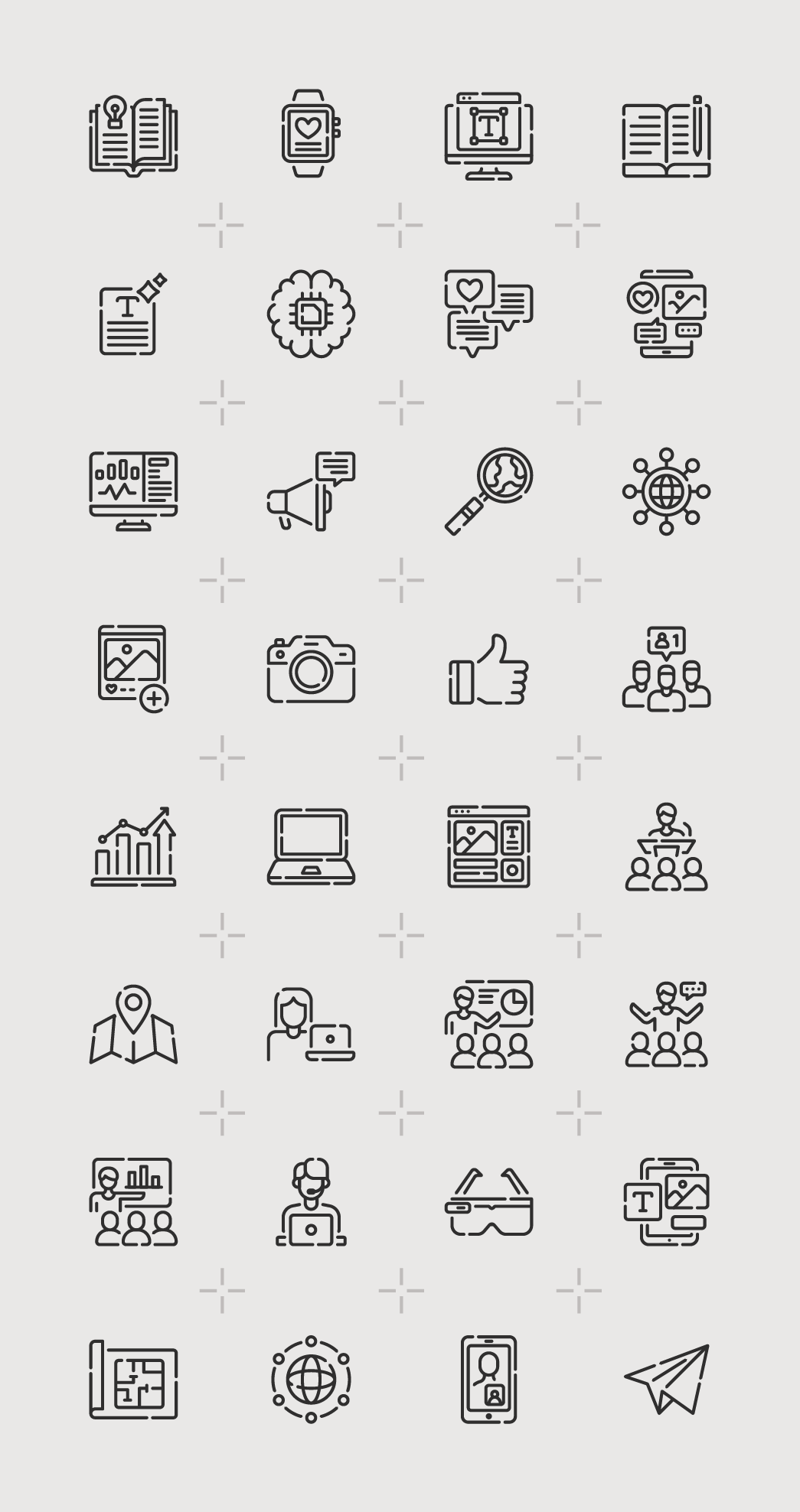
Developing a comprehensive icon library for Novuna required thinking beyond individual icons — it meant establishing a visual language that could grow consistently over time and work across every context the brand touches, from technical documents to digital interfaces.
The foundation of the system is the square grid. Every icon is designed within a fixed bounding box, which enforces visual consistency across the full set regardless of subject matter. Whether the concept is abstract, like a neural network or a global distribution system, or functional, like a camera or a thumbs up, all icons share the same optical weight, stroke width, and internal spacing. This discipline means they can be placed alongside each other without any one icon feeling heavier or more intricate than its neighbours.
Scalability was a core consideration from the start. Designing within a modular grid means that as Novuna's communication needs evolve, new icons can be added by a designer who has never worked on the original set and still produce something that belongs. The rules do the heavy lifting. The line-based style also makes the icons technically straightforward to develop and adapt, clean enough to work at small sizes in UI applications, bold enough to hold at larger scales in print, and simple enough to be built as SVGs that remain sharp and lightweight across every resolution.
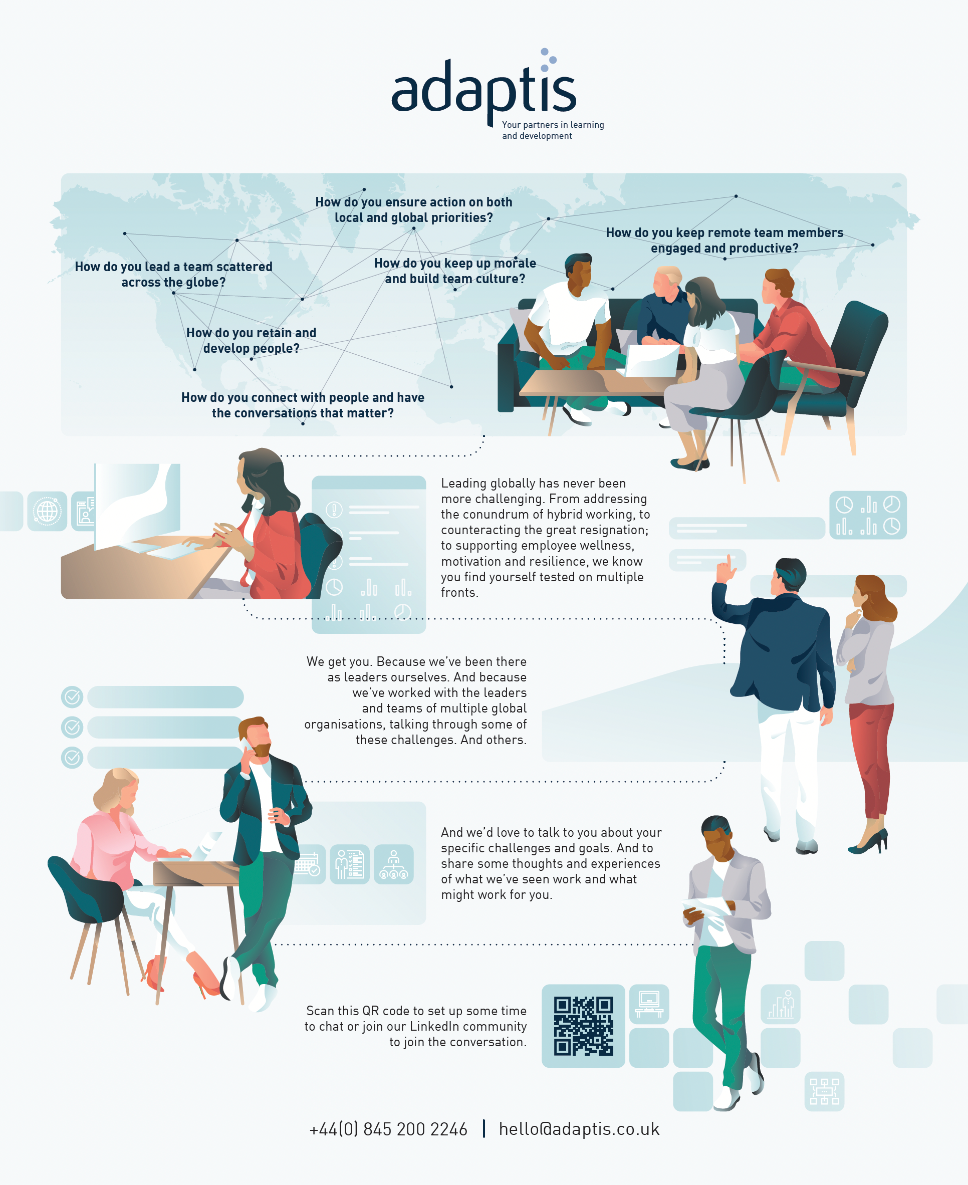
Where icon design demands structural thinking and restraint, editorial illustration asks something different entirely. The Adaptis global leadership infographic poster required constant decision-making about interpretation, tone, and visual narrative.
The brief was to communicate the complexity and human cost of leading globally, translating abstract challenges like hybrid working, employee retention, motivation, and cross-cultural communication into a single cohesive visual piece. Character-based illustration was chosen to bring warmth and relatability to the content, with figures place to suggest conversation, movement, and connection rather than hierarchy or formality.
A network map of questions overlaid across the composition frames the human element within the scale of the global challenge, drawing the reader in before the body copy takes over. The result is a piece that works as a conference handout, a printed marketing asset, and a digital communication, designed to start conversations rather than simply deliver information.